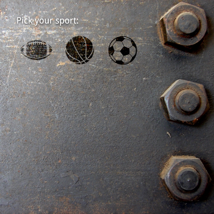
Decided to start playing around with the design of icons for Trainer By Sport. Instead of using a drop down of words, I wanted to use as many icons throughout the app as possible.
Creation of icons is a design practice within itself. You need to understand how to balance negative and positive space. The soccer ball proved a hassle. The lines where too frail or too thick, with a solid background, making the patches and stitches negative space. There wasn’t even a border at first.
The rules I learned in storyboard and product design then came into play. Use of thick lines around the edge of an item definitely made the soccer ball pop, I switched the roles so that the outline, patches and stitches where made of positive space.
Now the set, the football not being round was tricky to size. Too small and it looks well…too small. Too big it looks strange since it is not at all as tall as the football/soccer ball in reality.
Mad props to anyone who makes icons for a living!
Made in Illustrator.
I then brought the icons into Photoshop and was initially going to make them some bright color but turning them into an overlay and picking up on the texture of the background was dope. A nice touch to bring out the grunginess.
I added some states of the icon selection process and created a dropdown.

